We've built a better media component supercharged with Component properties. The new component has a bunch of new layout options.
New layout settings have been added to allow you to control the column width
Settings have been added to allow you to select what should appear first on mobile (text or media)
Media is now source ordered so that it appears after the text. This should improve SEO for the text.
With these customizations you're able to create the optimal look for your brand.
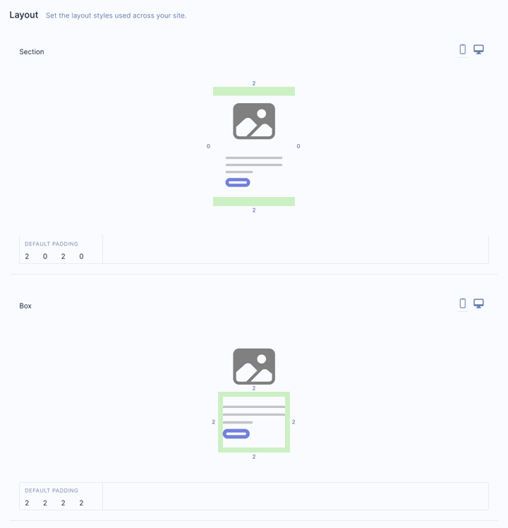
Spacing and width defaults for desktop & mobile
Create landing pages that look great on any device! In this release, we’ve introduced settings in the style guide that allow you to adjust the default width of sections. As a bonus, we’ve also introduced the ability to configure default padding on desktop AND mobile.
Box shadows
You can now add shadows on any box. You’ll see the shadow settings in the box toolbar on the paint bucket tab.
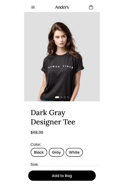
Sticky buy button
We've made updates to the product component so that the buy button will always be visible on mobile. It will now appear at the bottom of the screen when it’s not visible within the page making it easier than ever for shoppers to checkout.
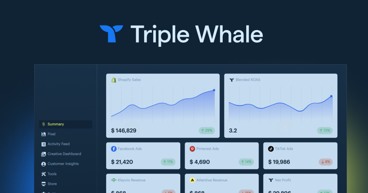
We've shipped an update to our TripleWhale integration and added support for tracking add-to-cart events.
TripleWhale describes itself as “the eCommerce OS.” It helps centralize metrics from a lot of common tools to provide better reporting for Shopify stores.
This is great because a majority of our agency partners and customers are using TripleWhale.
Good news for PostScript users! We've added an integration for PostScript. PostScript allows eCommerce companies to easily set up fully compliant SMS & MMS marketing.
This integration makes it easier then ever to connect your SMS campaigns to your landing pages.
Product Collection component actions
We did a quick update to the Product Collection component that changes the header so that actions now appear on the right (when the header is enabled).
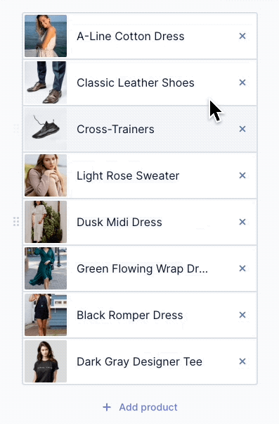
Drag & drop to rearrange product collections
We've added drag and drop within the product selection drawer to make it easier to rearrange items displayed in a collection.
These are just some of the new features. You can see a list of every released feature by going to our Release Notes in the Help Center.